
有许多JavaScript 库可用于绘制不同的图表,包括折线图、条形图、图形等等。
如果您正在尝试学习如何使用 JavaScript 在您的网站上动态显示数据,Chart.js是您可以测试的库之一。
React是最好的 JavaScript 框架之一,还提供了一组很酷的图表库,您可以通过这些库创建 Web 和混合应用程序的酷界面。
开始使用 Chart.js 开发数据可视化的步骤是什么?
在本文中了解如何操作。
Chart.js 是一个开源的数据可视化 JavaScript 库,可以绘制基于 HTML 的图表。
它目前能够支持八种可以动画的交互式图表。要使用 chart.js 创建基于 HTML 的图表,您需要一个HTML 画布来显示它。
该库可用于一系列数据集和其他自定义参数,如边框颜色、背景颜色等。
其中之一的数据集称为标签数据集,即 X 轴的值。另一个是数字的集合,通常沿着 Y 轴。
还需要在图表对象内部定义图形类型,以确保库可以确定要绘制什么图形。
正如我们之前提到的,您可以使用 chart.js 制作各种图表。
在本教程中,我们将从条形图和折线图开始。一旦您了解了这些图表类型的概念,您将拥有绘制其他可用图表所需的信息和工具。
首先使用 chart.js,创建所需的文件。在本指南中,文件的名称将是 chart.html、plot.js 和 index.css。您可以使用任何命名约定来命名您的文件。
然后,将以下代码复制并粘贴到 HTML 文档的标题区域。这将创建提供指向 Chart.js 内容交付网络 ( CDN ) 的链接。
在 chart.html 上:
<head> <script src="https://cdnjs.cloudflare.com/ajax/libs/Chart.js/2.8.0/Chart.min.js"> </script> </head>
HTML文件的格式如下:
<!DOCTYPE HTML><html> <head> <title> Chart </title> <link rel="stylesheet" href="index.css"> <script src="https://cdnjs.cloudflare.com/ajax/libs/Chart.js/2.8.0/Chart.min.js"></script> </head> <body> <header> <h1> Charts </h1> </header> <canvas id="plots" style="width:100%;max-width:700px"></canvas><script src="plot.js"></script></body></htm/>
在你的 CSS 中:
body{ background-color:#383735;}h1{ color:#e9f0e9; margin-left:43%;}#plots{ margin:auto; background-color: #2e2d2d;}
上面显示的CSS样式不是标准的。你可以根据你的喜好,根据你的 DOM 的结构来设置它的样式。当您完成 HTML 或 CSS 文件并准备好使用 JavaScript 创建图表时。
对于要使用 chart.js 创建的折线图,您需要将图表类型更改为折线。这告诉库如何绘制折线图。
为了显示这一点,在 JavaScript 文件中:
// Get the HTML canvas by its id plots = document.getElementById("plots");<strong>// Example datasets for X and Y-axesstrong> var months = ["Jan", "Feb", "Mar", "Apr", "May", "Jun", "Jul"]; <strong>//Stays on the X-axisstrong> var traffic = [65, 59, 80, 81, 56, 55, 60] //Stays on the Y-axis // Create an instance of Chart object:new Chart(plots, { type: 'line', <strong>//Declare the chart typestrong> data: { labels: months, <strong>//X-axis datastrong> datasets: [{ data: traffic, <strong>//Y-axis datastrong> backgroundColor: '#5e440f', borderColor: 'white', fill: false, //Fills the curve under the line with the background color. It's true by default }] },});输出:
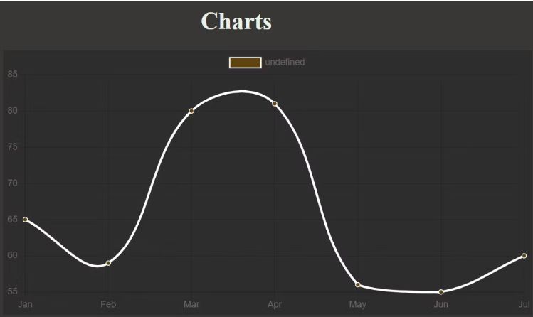
随意将您的填充值更改为真实,使用其他数据或修改颜色以观察发生的情况。
如您所见,顶部附近有一个额外的图例框。您可以将其从选项参数中取出。
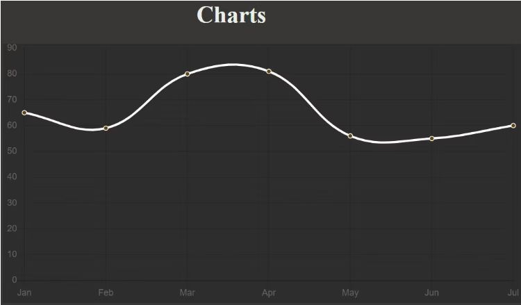
除了删除或添加图例之外,它的选项参数还可用于进行其他调整。例如,您可以应用它来使轴从零开始。
定义选项参数。这是 JavaScript 文件中图表部分的外观:
// Create an instance of Chart object:new Chart(plots, { type: 'line', <strong>//Declare the chart typestrong> data: { labels: months, <strong>//X-axis datastrong> datasets: [{ data: traffic, <strong>//Y-axis datastrong> backgroundColor: '#5e440f', <strong>//Color of the dotsstrong> borderColor: 'white', <strong>//Line colorstrong> fill: false, //Fills the curve under the line with the background color. It's true by default }] },<strong> //Specify custom options:strong> options:{ legend: {display: false}, //Remove the legend box by setting it to false. It's true by default. //Specify settings for the scales. To make the Y-axis start from zero, for instance: scales:{ yAxes: [{ticks: {min: 0}}] //You can repeat the same for X-axis if it contains integers. } } });输出:
您还可以为每个点的背景选择不同的颜色。然而,这种方式的背景颜色变化通常更适合条形图。
这是唯一一次您必须将图表类型更改为条形。无需更改颜色选项的选项,因为条形将自动继承其背景颜色:
// Create an instance of Chart object:new Chart(plots, { type: 'bar', <strong>//Declare the chart typestrong> data: { labels: months, <strong>//X-axis datastrong> datasets: [{ data: traffic, <strong>//Y-axis datastrong> backgroundColor: '#3bf70c', <strong>//Color of the barsstrong> }] }, options:{ legend: {display: false}, //Remove the legend box by setting it to false. It's true by default. }});输出:
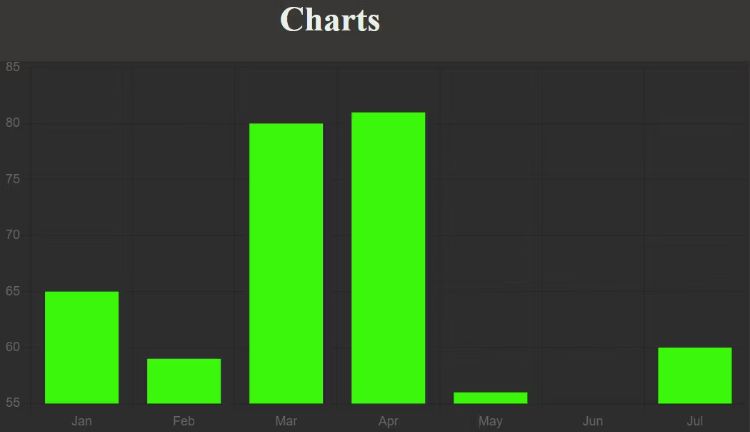
随意将 Y 轴设置为从零或任何其他值开始,就像您对折线图所做的那样。
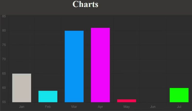
要为每个条使用不同的颜色,您必须将与数据中的项目数量兼容的颜色数组传递给 backgroundColor 参数:
// Create an instance of Chart object:new Chart(plots, { type: 'bar', <strong>//Declare the chart typestrong> data: { labels: months, <strong>//X-axis datastrong> datasets: [{ data: traffic, <strong>//Y-axis datastrong> <strong>//Color of each barstrong>: backgroundColor: [ "rgba(196, 190, 183)", "rgba(21, 227, 235)", "rgba(7, 150, 245)", "rgba(240, 5, 252)", "rgba(252, 5, 79)", "rgb(0,12,255)", "rgb(17, 252, 5)"], }] }, options:{ legend: {display: false}, //Remove the legend box by setting it to false. It's true by default. }});输出:
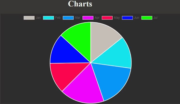
要创建饼图,请将图表类型切换为饼图。也可以使图例的显示为真以确定饼图的每个部分是什么:
// Create an instance of Chart object:new Chart(plots, { type: 'pie', //Declare the chart type data: { labels: months, //Defines each segment datasets: [{ data: traffic, //Determines segment size //Color of each segment backgroundColor: [ "rgba(196, 190, 183)", "rgba(21, 227, 235)", "rgba(7, 150, 245)", "rgba(240, 5, 252)", "rgba(252, 5, 79)", "rgb(0,12,255)", "rgb(17, 252, 5)"], }] }, options:{ legend: {display: true}, //This is true by default. } });输出:
就像您在前面的示例中所做的那样,通过更改图表类型来尝试不同的图表。
但是,支持一些 chart.js 图表类型。chart.js 图表类型,您可以使用上面的代码约定:
尽管您在本教程中只熟悉了饼图、折线图和条形图,但使用 chart.js 绘制其他图表的 Code Pattern 也基于相同的原理。您也可以自由地尝试其他图表。

 暂无任何评论,欢迎留下你的想法